Bruker
Bruker Design System
Aligning AEM and Figma around a leaner design system and a clearer search experience.
- Industry
- Scientific Technology
- Discipline
- Design systems and UX
- Contribution
- UX refinement · Design-system consolidation · AEM and Figma alignment · Typography and iconography
The situation
Bruker's website, AEM style guides and Figma documents had drifted apart. Hundreds of styles, inconsistent fonts and accumulated fixes created visible inconsistencies and too many assets to manage. The challenge was to bring the design system and the user experience back into alignment.
The cleanup became a better experience.
The work connected two needs: a coherent interface for users and a manageable system for the people building it. Typography, icons and components became shared foundations across AEM and Figma, so each design decision could carry through to the website.
- AEM and Figma alignment
- Controlled typography
- Reusable components
- Icons and pictograms
- Search and filtering
Typography
A smaller system.
A stronger hierarchy.
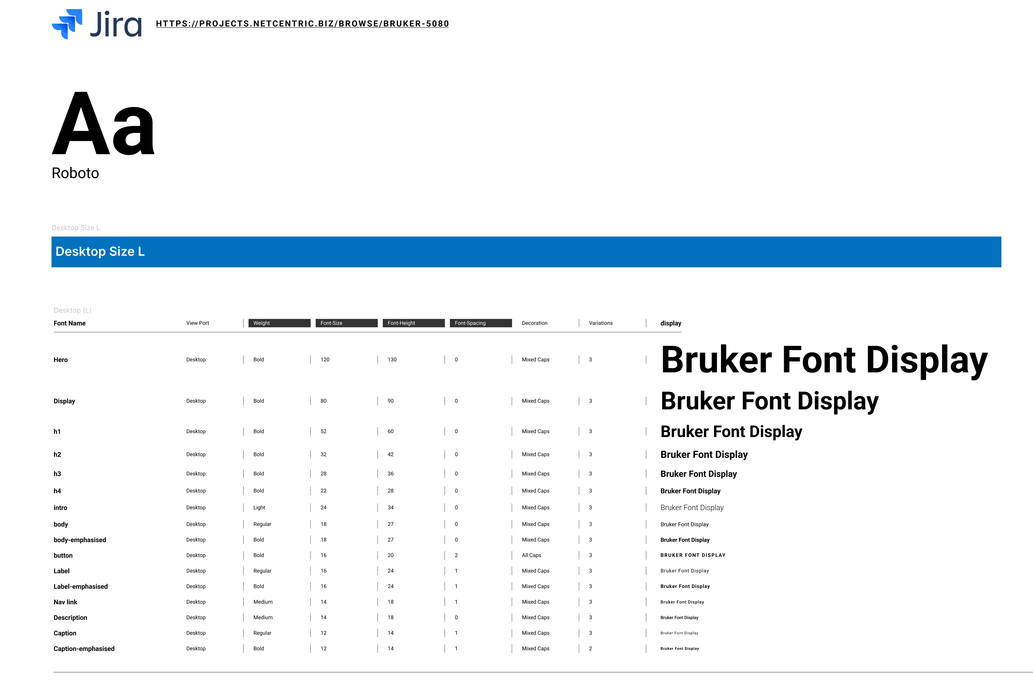
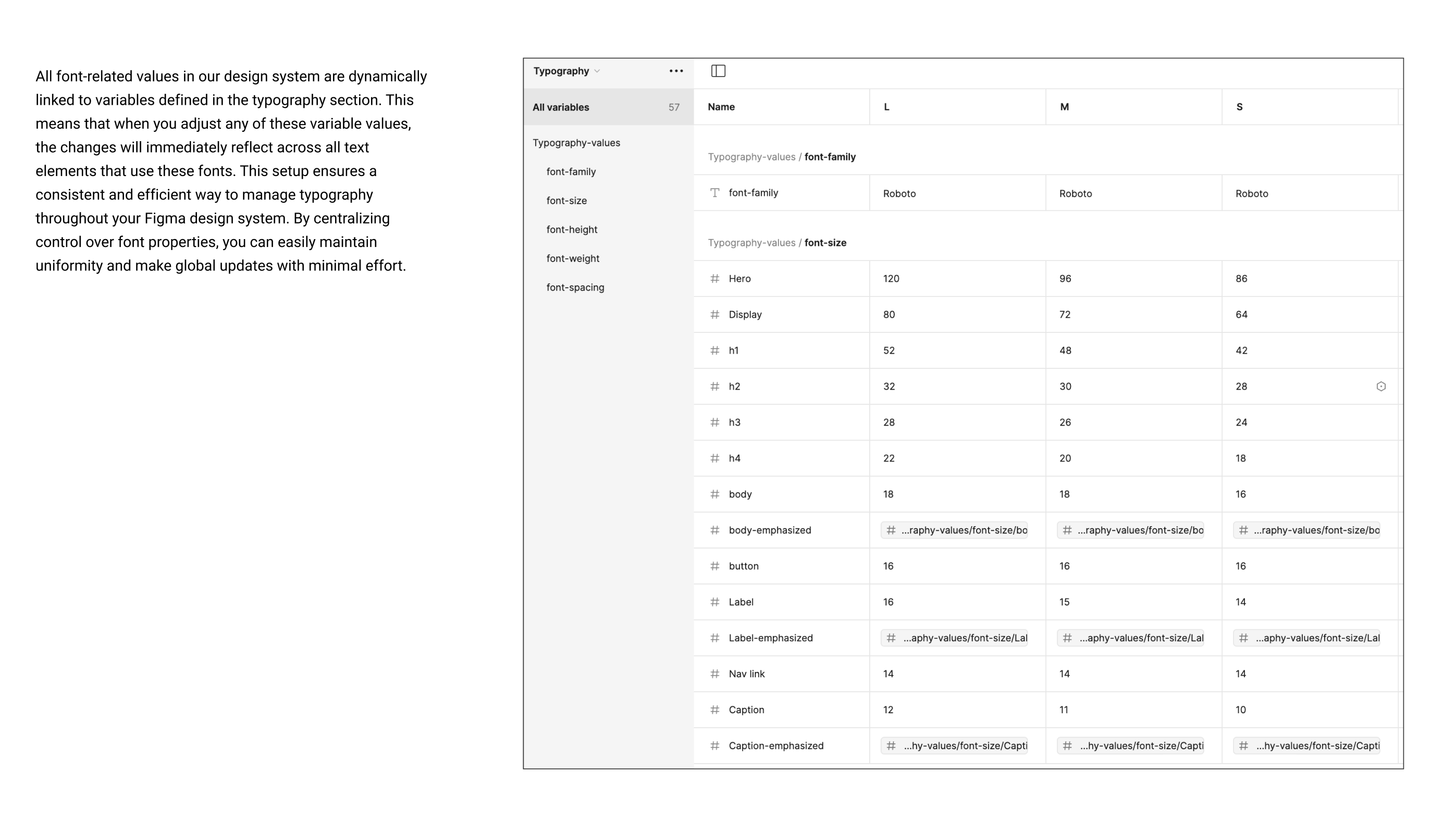
More than a hundred accumulated type styles became a controlled set of roles. Shared variables connect that hierarchy across screen sizes.
into a controlled set
Visual language
Simple symbols.
More ways to explain.
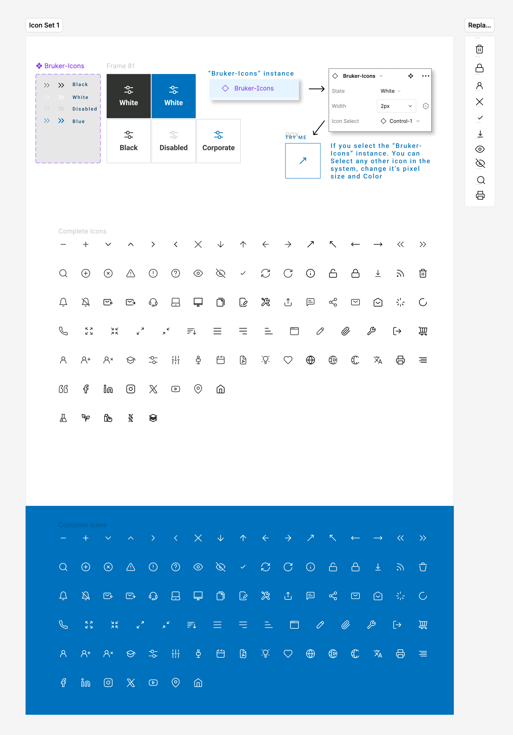
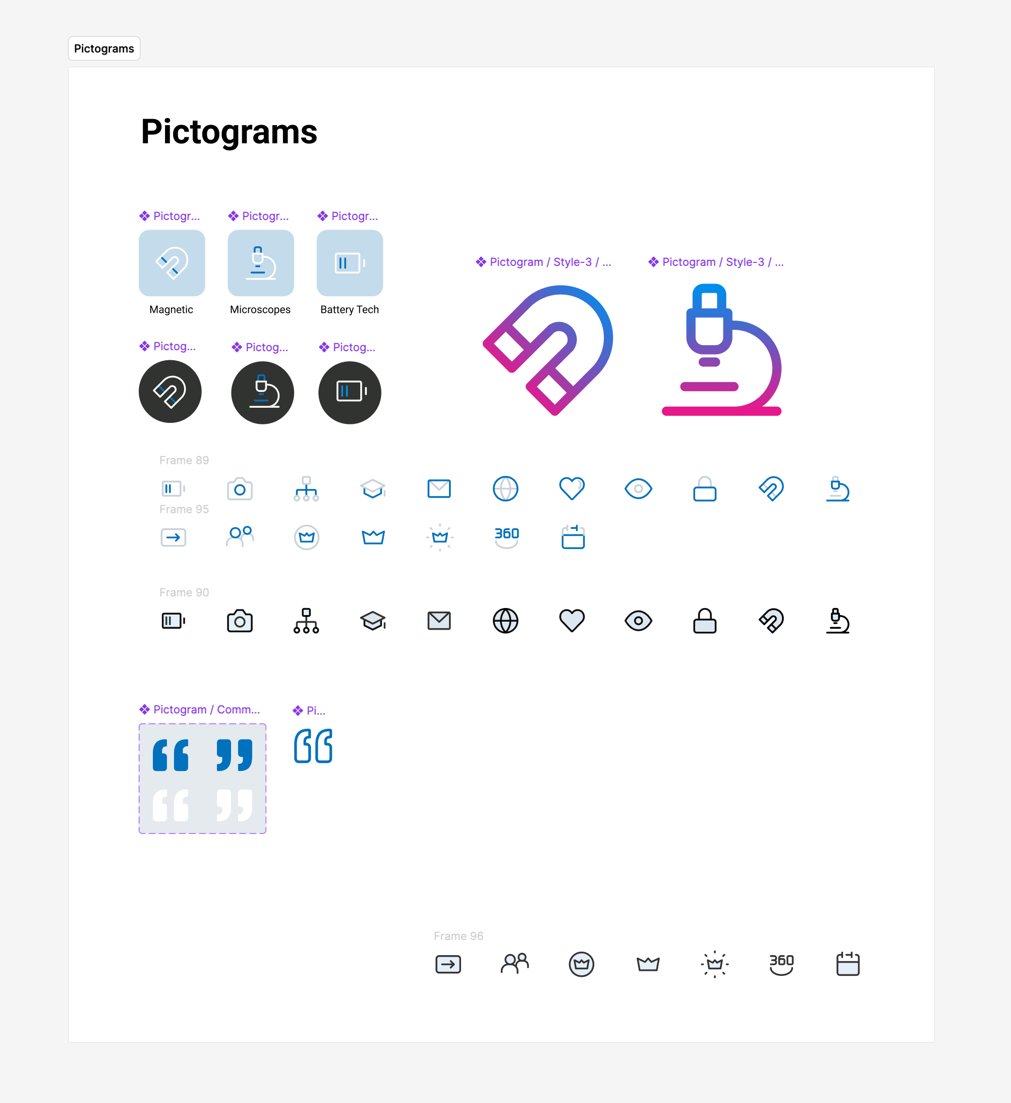
A consistent icon family handles everyday actions. Pictograms extend the same language into scientific subjects and more complex stories.
Search experience
Find. Refine. Explore.
Move from discovery to a focused selection. Browse conferences and trade shows, keep upcoming and on-demand events within reach, then refine the results through a dedicated filter panel.
View the original screensThe move
We refined the UX while cleaning up and synchronizing AEM components with their Figma designs. More than a hundred type styles were consolidated into a small, controlled set of roles, supported by shared typography variables. We rebuilt the component language, unified the iconography and developed pictograms that could explain more complex subjects using simple visual building blocks. A redesigned search journey brought those foundations into a more direct way to discover and filter content.
Fewer styles. Clearer choices. One shared system.Next projectŠkoda Connected Experience